Breaking news: you don’t need to be an experienced web developer to publish a page that looks beautiful and creates conversions.
The power of drag-and-drop page builders today makes it so easy to build a landing page from scratch in a matter of hours. That’s great news for anyone running an online business, especially if they’re tight on time and budget.
With that said, the internet is scattered with millions of landing pages. And to get visitors to stay on your landing page, it needs to be captivating and gosh-darn convincing.
More importantly, it needs to fulfill a single goal, which is to encourage visitors to click your call to action (or CTA) and convert – whether that’s to buy, download, or sign up just to name a few.
To help you get the ball rollin’ in the right direction, we’ve compiled ten best practices to follow when building a landing page.
But before you put on your goggles and dive into the best practices, let’s talk about what a landing page is and why it’s important to have one.
Table of Contents
What Is a Landing Page?
A landing page is a standalone page on your website that is created specifically for a digital marketing campaign.
As the name suggests, a landing page is where a web visitor lands after they click on a call to action or a link in a digital ad on Google, social media, or in an email, for example.
Landing pages are created with one purpose, and one purpose only. That is to persuade web visitors to click on a call-to-action button and get them to buy your products, sign up for your newsletter, make reservations, or download your e-book.
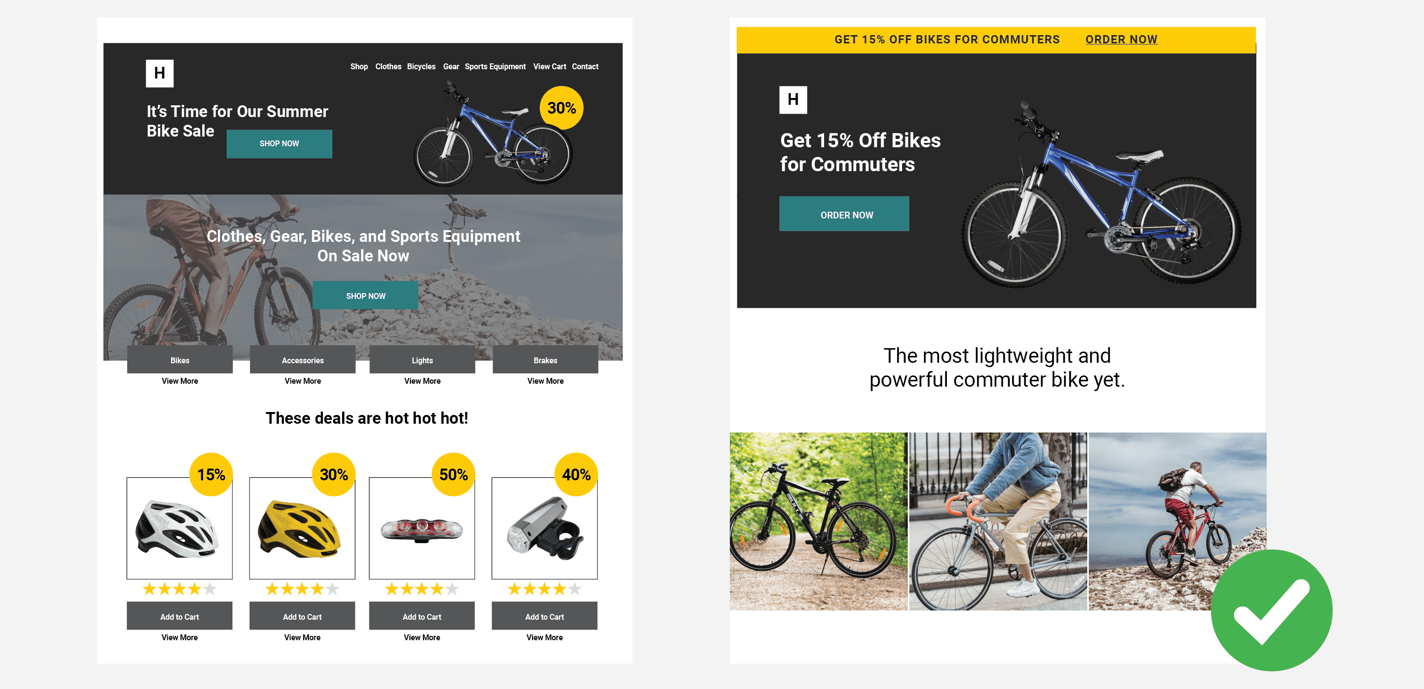
With one primary goal, a landing page is a far superior option for increasing the conversion rate of any digital marketing campaign than a homepage on its own.
As you can see in the illustration above, a homepage doesn’t have just one focus – it contains more than a handful of CTA buttons and links. It’s perfect for showing an array of products or services to your visitors at once.
On the other hand, a landing page is built for a different purpose. It is a lot more minimal in design and contains a single conversion goal. This is to help get your message across quickly and acquire more leads or make more sales. A landing page is meant to simplify the navigation for users, guiding them to that one call-to-action button.
Because it eliminates any distraction from fulfilling that one goal and is specifically designed to turn visitors into customers, using a landing page can also reduce your cost per acquisition. Now, who wouldn’t want that?
To learn more about the importance of landing pages and find out how our digital marketing team can help your business, visit our digital service page: Landing Pages.
Ready to build a high-converting landing page? To get you started, below are some best practices to follow.
Landing Page Best Practices
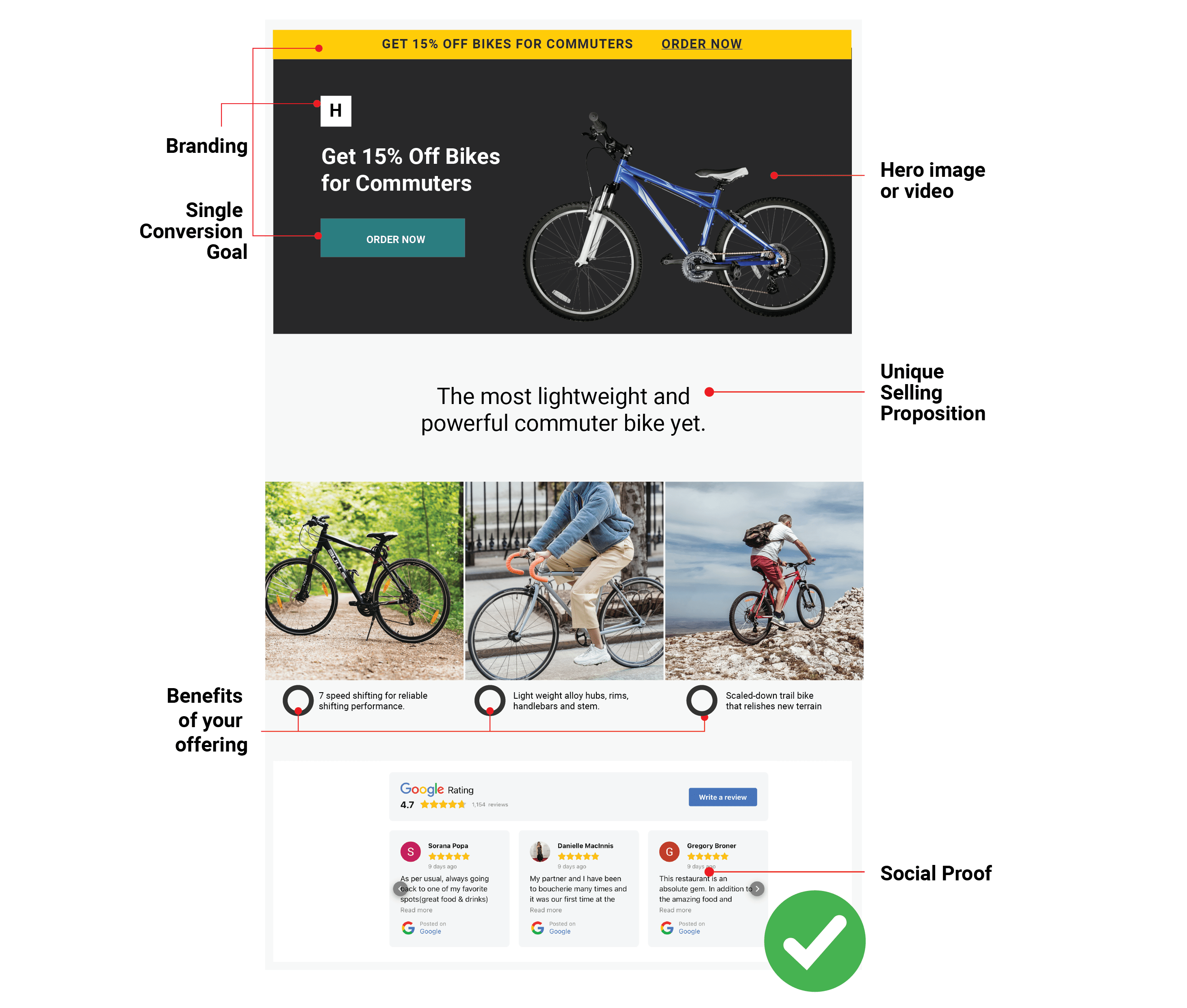
When it comes to creating landing pages, there are no hard and fast rules. Of course, you want your landing page to stand out from the rest. You want it to be unique to your brand and not have cookie-cutter content. We do, too.
However, like with anything else in digital marketing, it’s important to know the fundamentals like the back of your hand. This allows you to have a strong foundation when building a landing page.
Once you get more comfortable and start to understand what your audience likes to engage with, you can then break the rules, experiment, and break the rules some more. Just keep in mind what your landing page goal is and find the best way to get the highest conversion rate.
Here are ten best practices to give you a head start.
1. Keep Your Message Consistent from Ad to Page
A landing page is where users land when they click on an ad or a link in an email. They clicked on the ad because you clearly made an offer they could not refuse. So make sure you’re sending users to a page that communicates the same message as your ad.
If the landing page doesn’t match their expectations, your visitors will quickly bounce off and leave the page. You lose their attention, you lose a sale.
To avoid a lost conversion, ensure that your ad and the corresponding landing page feature the same offer and convey the same message in the same brand voice. To put it simply, the offer and the ask need to be identical.
For example, if you’re running a social ad for an online music class and offering a free trial, don’t ask for payment details on the landing page. Always follow through with the same offer to effectively increase your conversion rate.
2. Use Clear, Conversational Language
Great copy doesn’t make it obvious that you’re trying to sell something. If your copy is shouting “BUY ME”, people are more likely to click away from the page than click on your CTA button.
Use clear, compelling language that everyone can understand. This helps establish a human connection with your visitors, encouraging them to engage further with your landing page and convert.
Look at every single element that requires copy – from the headline to the call the action. Make sure the language you use is relevant and one that people can resonate with. For a more detailed guide, read our blog article More Than a Button: How to Create High-Converting CTAs.
Generally, it’s best to keep your copy short and easy to read. If the product or service you’re offering demand longer copy, consider using bulleted lists or, better yet, infographics if relevant.
3. Keep the CTA Above the Fold
To increase clicks, your call to action needs to be visible on the screen before your users scroll further down the page.
It seems like the obvious move, but you’d be surprised how many digital marketing campaigns don’t succeed because the CTA is too far down the landing page.
Along with the call the action, keep other important elements including the headline and unique selling proposition (or USP) visible by placing them above the fold. These elements need to be the very first thing people see when they land on your page.
4. Less Is More
Sometimes, less is more. And this is certainly true for landing pages.
Picking up from the previous point, it’s crucial that the information that your visitors need to see from the get-go is placed where it’s highly visible. But this DOES NOT mean you should over-crowd the top half of your landing page with a hundred different elements.
Keep. It. Simple.
Remember, a great landing page must focus on a single conversion goal. To keep users on the page, remove site navigation elements and other unnecessary distractions that might force them to bounce away.
Don’t be scared to use white space and bold colours. Use relevant images or videos to make your page visually engaging. Play around with typography, see what works best to effectively call out your unique selling proposition and highlight your call to action.
5. Highlight User Benefits With Visuals
Show how your product or service works in a real-life context using visuals. Use still images, demo videos, or animations to captivate your audience and literally show what’s in it for them when they click the CTA button.
Keep your visuals straightforward, relevant, and on-brand. Similar to the copy, your visuals need to resonate with users and are easy to digest.
The hero image section above the fold is the best place to show your product or service in action.
Looking for video experts to help elevate your landing page? Check out the solutions our team can provide by visiting our digital service page: Video Marketing.
6. Use Authentic Social Proof
People on the internet are becoming more and more savvy. They can see marketing BS from a mile away.
People trust other people’s opinions. On a landing page, including real social proof like customer reviews and testimonials can help visitors feel more confident and reassured about engaging with your business.
7. Make It Snappy
Whether we like to admit it or not, we all have a short attention span.
Nobody likes to wait for a page to load – ain’t nobody got time for that. If your page is taking more than three seconds to load, you risk losing potential customers.
Improve your page load time by removing unnecessary elements. Every imagery, every copy, and every element on your landing page needs to serve a specific purpose. Avoid using fluff and content that will only slow down your page.
Make sure you optimise all your images and videos and test your page load time using Google’s Page Speed Insights. Follow Google’s speed recommendations to ensure a smooth, enjoyable experience for your web visitors.
8. Create Mobile-Responsive Content
This may come as no surprise, the majority of internet users today consume digital content on their smartphones. According to Oberlo, mobile accounts for just over 58 percent of web traffic worldwide. And this number is projected to grow over time.
To hit your mobile conversion rate target, you need to design a mobile-responsive landing page that adapts to smaller screens.
Optimise text, images and videos, layout and design for mobile users. For a more detailed guide on how to create mobile-responsive content, read our blog article: 3 Ways to Create Mobile-Responsive Content.
9. Test, Test, Test
Understanding the fundamentals and following best practices are great and all. But how do you truly know your landing pages are working?
Testing helps you take a deeper dive into your landing pages. It allows you to see what’s working and identify any roadblocks that may be stopping you from achieving your conversion goals.
The beauty of digital marketing is that you don’t have to rely on gut feeling alone to make decisions. Who wants that kind of pressure?
You can collect data to help improve your landing pages in multiple ways.
Use heatmaps to track visitor mouse clicks and scroll activity on your page. This lets you identify what people are engaging with and what can use some work.
Another way to collect data is through A/B testing. Test multiple page elements including CTA button designs, headlines, visuals, lead capture forms, and more. This allows you to see what your visitors resonate with and engage with the most.
10. Let Someone Else Do the Heavy Lifting for You
Knowing how to create a landing page is certainly a flex.
But if you are just starting your online business, have limited resources, or are just simply short on time, asking for help may be a more ideal option for you.
At DGA, we have digital marketing experts that are ready to do the heavy lifting. We can plan, build, and test high-converting landing pages to support your campaigns – from developing content to tracking and analysing results, we’ve got you covered.
Ready to collaborate with our Digital Marketing Team? Visit our digital service page: Landing Pages to learn more about the solutions we can provide. Alternatively, you can give us a call to chat about your needs and goals.
