Did you buy those jeans that were on sale? Or subscribed to receive monthly personalised hair products out of curiosity? Or booked a flight to Europe that you (let’s be real) probably couldn’t afford because you didn’t want to miss out on a great deal? Every action you take on the internet is likely because of a shiny, persuasive call-to-action or, as the cool kids call it, a CTA.
Shop Now. Discover More. Subscribe. You see call-to-action everywhere online on landing pages, emails, and even social media posts. They come in many different forms – a button, a text hyperlink, or just plain text.
When done right, CTAs tell your target audience to take a specific action through persuasive messaging and, of course, attention-grabbing design.
When crafting a call-to-action, the possibilities are virtually endless! They can be as short and as creative as you want them to be.
But why exactly do you need CTAs? Imagine a landing page without a CTA button. It’s like a front door without a handle. Yes, your prospects are on your page. But with no CTA in sight, they have nowhere else to go. As a result, they leave and you lose significant conversions.
According to Unbounce, more than 90% of web users who read the headline on your banner also read your CTA copy. CTAs are also effective in email marketing. According to WordStream, emails with a single CTA increased clicks by 371% and sales by a whopping 1617%! What would be more convincing than that?
In this article, we’ll share a few tips and tricks on how to write the perfect call-to-action. But first, let’s talk about the different types of CTAs.
Table of Contents
3 Key Types of Call-to-Actions

1. Lead Generator
Lead generation calls-to-action aim to convert visitors into – you guessed it – leads. Placement is key when it comes to lead generators. Typically, these CTAs go on the hero banner of homepages or landing pages where content sees the highest percentage of eyeballs.

2. Digital Word Of Mouth
Social sharing CTAs are more powerful than you think. These are the calls-to-action that go on the sidebar of a landing page or even on the social post itself. When used effectively, these CTAs nudge your audience to spread the word about your brand to their friends and followers on social media platforms.
3. The Guide
There’s no shortage of “Learn More”, “Discover More”, or “Find Out More” on the internet. These are the most used CTAs on web pages, blogs, emails, and social media posts. And for good reason. Simple yet effective, these CTAs guide users to blogs and other resources that they may find useful.
Now for the fun part…
5 Tips for Creating Persuasive Call-to-Actions
1. Use Action Words
Remember: less is more. Be clear and direct with your CTA. There’s no need to write a whole sentence – sorry, but ain’t nobody got time for that. Seriously. A Nielsen research study shows that, on average, users will read at most 28% of the words on a web page during their visit. And users often leave a site in 10-20 seconds if they’re not interested.
With that in mind, your CTA needs to get straight to the point if you want your visitors to stay on your site.
If you run an online store, for example, use action words like “Buy”, “Order”, or “Save” in your CTA.
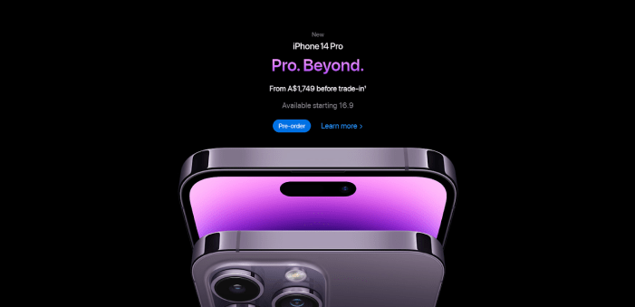
No one pulls off minimal aesthetics better than Apple. Their visuals never fail to get straight to the point. And clearly, neither do their call-to-action.
2. Get Creative
Don’t be afraid to think outside the box. When it comes to writing persuasive call-to-action, creativity is always key.
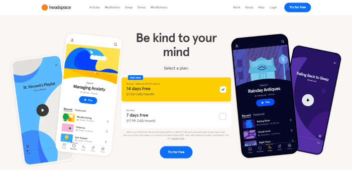
Headspace keeps it simple with their primary CTA, but they get creative with the surrounding copy. Not only does the copy provide more context, but it also gives prospects a clear picture of what they will receive when they try the app.
This example illustrates that CTAs are a great way to show off your brand’s personality, so you may as well get witty with it!
3. Provide a Solution
Always let your unique value proposition take centre stage. Communicate why customers should choose to buy your products, subscribe to your newsletter, or sign up for your services.
Whatever your value proposition is, your CTA needs to highlight how your service or product will solve a customer’s problem. Need to come up with a unique value proposition? Check out our step-by-step guide here.

Let’s take Notion, project management and note-taking tool, as an example. The current banner on their homepage highlights their unique value proposition clearly in the copy. It gets to the point right from the get-go and is followed by a strong call-to-action: “Get Notion free”. To us, that screams “Click me”.
4. Create Urgency
How often have you clicked on a “Shop Now” button because you didn’t want to miss out on a sale? We get it. FOMO is a real thing. We wouldn’t want to miss out on the latest and greatest trends either.
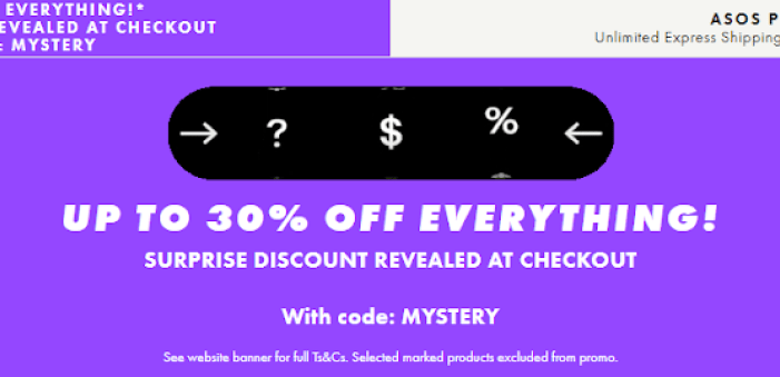
eCommerce stores like ASOS create urgency unlike any other. With big, bold CTAs like “Free Delivery”, “Up to 30% Off”, or “Limited Time Only”, you can trigger the fear of missing out and prompt your customers to act ASAP.
5. Go Big, Go Bold
Colours matter when designing your CTA (as well as the copy and the visual elements around it, of course).
Different colours evoke different emotions. In general, warm colours such as red, yellow and orange, can spark a sense of urgency. Cool colours such as green, blue and purple on the other hand, often evoke feelings of calm and security.
Ultimately, the colour that you choose for your CTA will depend on your website design. But always make sure that the colour you pick stands out against the background. The bolder, the better

Other things you need to consider when crafting your CTA button are the shape and its size. Again, these will depend on your site design. Our tip is to make your button big enough so it stands out, but not so big that it ruins your overall page design.
As for the shape, you’ll need to A/B test what works best for your business. Though most of the time, rounded buttons tend to perform better than buttons with sharp, square edges.
If you want to learn more about designing high-performing web pages with effective CTAs, check out our service page: Performance Website Design.
Get Inspired By These Examples of Effective Call To Actions
Before we wrap up the article, here are a few more examples of effective CTAs for inspiration:
Netflix

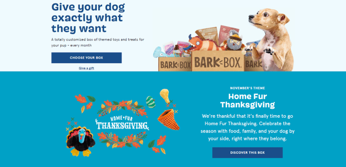
Bark Box
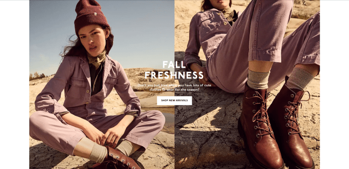
Madewell
MUD\WTR

Audible

Get Crafty
Evidently, CTAs are more than just a button or a link on a page. When done right, they prompt customers to buy your products, subscribe to your newsletter, follow you on social media, or read your blog.
When designing your next landing page or putting together your next social media campaign, take a more detailed look at your CTA – from copy to colour. Use our tips and tricks above to make sure you get your message across and skyrocket your conversions. Don’t be afraid to experiment, and make sure you track performance to get maximum clicks!
From crafting high-converting CTAs to optimising your entire website, our digital marketing experts are here to help! Check out our Digital Marketing Services page to learn more about what we can provide. Or give us a call today to chat about your business needs.