In today’s digital age, where the competition for user attention is fierce, understanding the behaviour of site visitors is crucial. Websites have a tiny window of opportunity to grab attention and make a lasting impression. A recent report from CXL provides revealing insights into this very aspect, shedding light on how swiftly users scan a site’s layout.
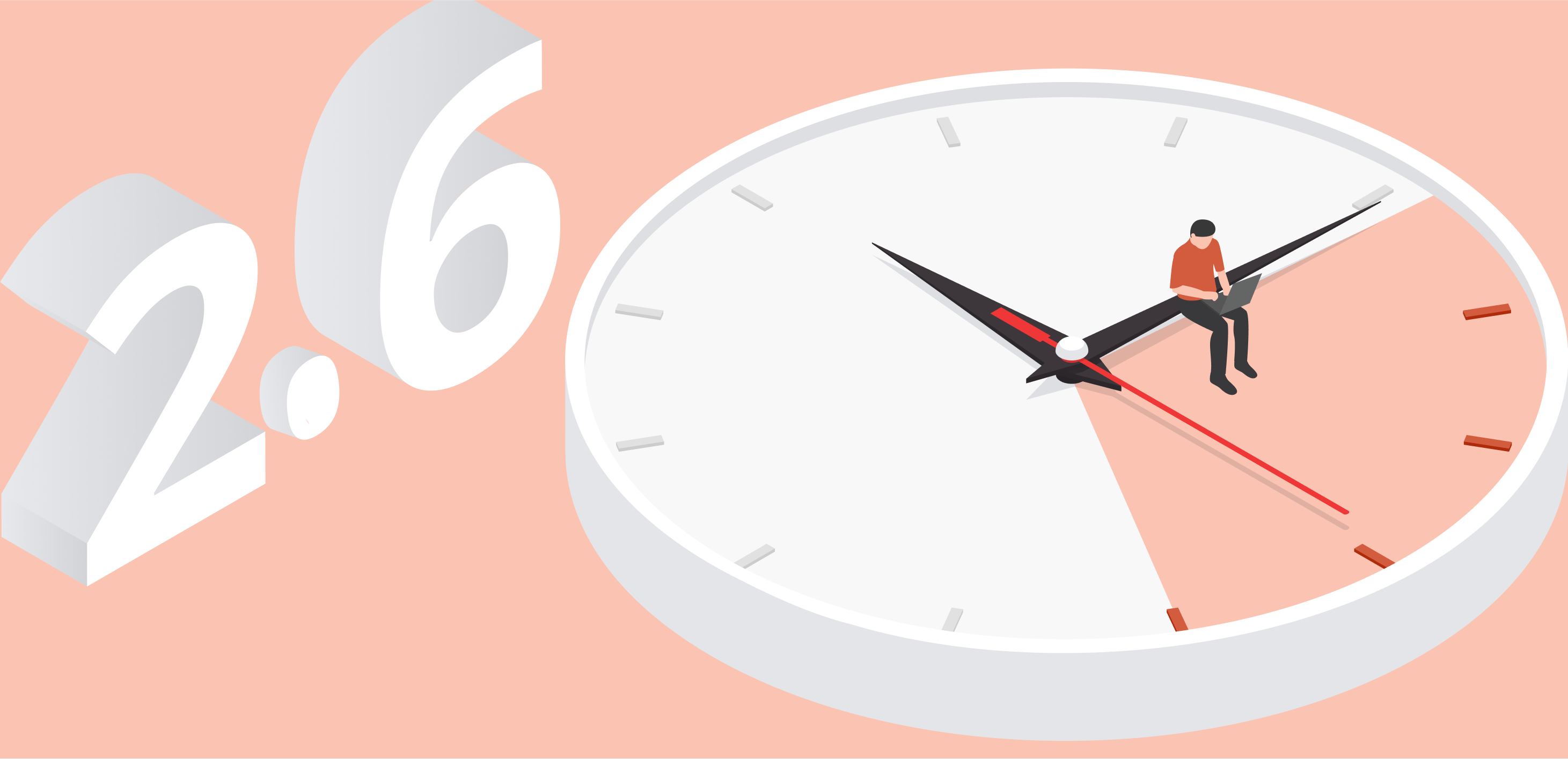
2.6 Seconds – The Magic Number
According to the CXL report, users on average take just 2.6 seconds to scan a webpage’s main area. Think about that! It’s less than the time it takes to tie a shoelace. In that blink-and-you-miss-it time frame, visitors judge the aesthetics, relevance, and possible utility of a website. For businesses and web designers, this underscores the importance of not just the content but also the design, layout, and user interface.
Spotlight on the Top 6 Sections
The same report not only details the average time users take to scan a website but also pinpoints the sections that capture the most attention. Here’s a breakdown:
- Logo (6.48 seconds): This statistic underlines the power and significance of branding. A website’s logo isn’t just about identity but also trust, reliability, and professionalism. The extended time spent on the logo suggests that visitors associate a brand’s logo with its credibility and overall reputation.
- Main Menu (6.44 seconds): The main menu, acting as a navigation guide, is understandably a major focal point. A clear, intuitive main menu ensures visitors can easily find what they’re looking for, enhancing the user experience.
- Search Box (Approximately 6 seconds): In the era of instant gratification, users prefer quick solutions. A prominent search box allows visitors to skip the navigation process and directly search for what they’re interested in.
- Main Image (5.94 seconds): A picture speaks a thousand words. The main image or hero shot on a website can immediately convey the essence of a brand or the purpose of the site. Choosing the right image that resonates with your target audience can make all the difference.
- Written Sections (5.59 seconds): While images grab attention, content retains it. Quality written sections, be it headings or brief descriptions, give depth to a site and provide essential information that users seek.
- Bottom Parts (5.25 seconds): Often reserved for footers, contact details, or additional links, the bottom parts of websites are not to be ignored. Given the significant attention they receive, ensuring they are well-designed and informative can enhance user engagement.
Final Thoughts
In conclusion, while users might scan a site’s main layout in a mere 2.6 seconds, they spend more time on specific sections that matter to them. This data offers invaluable insights for website designers, marketers, and businesses. By focusing on these key areas and optimising them for user engagement, businesses can enhance their digital presence and create lasting impressions in the minds of their visitors. Remember, in the world of online browsing, every second counts!


